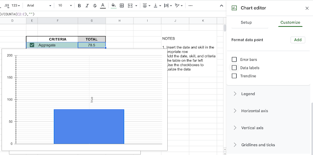
I created a chart from some data. Gridlines would definitely help to make it easier to read, but a label would be even better.
To add a label, go into the chart editor and click on Customize in the top menu. Then scroll down to Series. In the Series menu towards the bottom are three checkboxes - the last one is Data labels. You might need to change the format.
Click on the drop down menu and select from source data.


No comments:
Post a Comment